
 Featured Image: Pantone’s 2022 Color Of The Year – Very Peri 17-3938
Pantone is known for their 20-year tradition of selecting an official color to set the tone and mood for the year’s design trends. While 2021 was marked by the unique selection of two colors—Ultimate Gray and Illuminating—this year Pantone has gone a very different route.
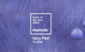
Pantone announced the choice of Very Peri (PANTONE 17-3938) as their official 2022 Color of the Year. This periwinkle hue is fresh and cool, representing creativity and complexity. This color is a brand-new creation, and the first time that one has been created for Pantone’s annual Color of the Year.
In the announcement, Pantone’s Vice President Laurie Pressman states, “Creating a new color for the first time in the history of our Pantone Color of the Year educational color program reflects the global innovation and transformation taking place.” Leatrice Eiseman, Executive Director of the Pantone Color Institute describes Very Peri as “a novel perspective and vision of the trusted and beloved blue color family” with “a spritely, joyous attitude and dynamic presence.”
Looking for ways to use Pantone’s Very Peri in your home design or décor? Let’s check out some ideas!
Image: Flash White Ceramic Bathroom Wall Tile from Arizona Tile
A soft, soothing blue tone like Very Peri can be a beautiful wall color choice in a bedroom, bathroom, or living area. Use it as an accent color along with a more neutral-toned tile like our Flash White for a dynamic look, or paint a baby nursery in this joyful hue for something different than the usual blue or pink.
Image: Gioia Sky, Azure, & Navy 4×16 Porcelain Tile from Arizona Tile
Tile Colors That Complement Very Peri
If you plan to use Very Peri or a similar color in your home’s color palette, you may be looking for tile that complements purple and blue tones. From other bold colors to modern neutral tones, let’s take a look at some tile that would look perfect alongside Very Peri.
Soft pastels provide a sweet and charming balance when paired with a cool purple tone like periwinkle. Our Gioia tile series has several options that would work well here. Colors like bone, aqua, and sky offer a light, chic, and sophisticated look.
 Image: Faro Silver 12×24 Porcelain Floor Tile from Arizona Tile
Timeless neutral colors like gray, taupe, and white also complement Pantone’s Color of the Year. Porcelain tile such as Faro, Ardesia, or Icon is a subtle yet complementary counterpart to Very Peri’s brighter tone. With soft patterns that won’t compete visually with vivid color, these options help create balance in a room that features Very Peri.
Image: Calacatta Gold Marble Countertop and Backsplash from Arizona Tile
Another natural complement to a purplish-blue color like Very Peri is gold. For an elegant impact, use Very Peri to bring out the gold tones in a marble or marble-look tile.
Looking for more ways to stay on trend with your home design in 2022? At Arizona Tile, our team of experts are always available for a consultation to help you choose the best tile and slab for your space. Discover your favorite tile in person at one of our locations, or explore our online design tools for more inspiration from the comfort of your home. Our Just Imagine Visualizer lets you see how a tile will look in your space before committing, and the slab yard locator lets you find the piece you need.
Filter by Category
Select category
- Grout
- Agglomerate Marble
- Mesh Mount
- Textured Tile
- Stains
- Maintenance
- Pavers
- New Products
- Basement Design
- Bar Tile
- Boise Location
- Large-format
- Wall Tile
- Patterned Tile
- Shower Tile
- Outdoor Tile
- R11
- 3D
- Limestone
- Quartzite
- Konkrete Tile
- Stonework Cladding
- Palm Desert Arizona Tile
- Anaheim Tile Showroom
- Glass Tiles
- Slab
- Fireplace
- Albuquerque Arizona Tile
- Uncategorized
- Scottsdale Arizona Tile
- Natural Stone
- Family Living Room Projects
- Van Nuys Arizona Tile
- San Marcos Arizona Tile
- Mudroom Entryways
- Exterior Tile & Slab Projects
- Tucson Arizona Tile
- San Diego Arizona Tile
- Mosaics
- Exterior Stone Projects
- Travertine Tile & Slabs
- Samsung Radianz Quartz
- Mission Viejo Arizona Tile
- Dining Room Tiling Projects
- Tile & Slab Remodeling
- Salt Lake City Arizona Tile
- Miramar Natural Stone Slab Warehouse
- Denver Arizona Tile
- Tile & Slab New Products
- Roseville Arizona Tile
- Miramar Arizona Tile
- Dallas Arizona Tile
- Tile & Slab FAQs
- Residential Tile & Slab Projects
- Marble Tile & Slabs
- Custom Fabricators
- Tile & Slab Cleaning Products
- Recycled Material
- Livermore Tile Showroom
- Countertop
- Tile Flooring
- Rancho Cordova Arizona Tile
- Livermore Natural Stone Slab Warehouse
- Commercial Tile & Slabs
- Tile Events and Shows
- Quartz Slabs
- Listelles & Medallions
- Cladding
- Tile
- Product Finder
- Las Vegas Arizona Tile
- Ceramic Tiles
- Tempe Arizona Tile
- Prescott Arizona Tile
- Kitchen Tile & Slab Projects
- Care of Surfaces
- Swimming Pool Tile
- Porcelain Tiles
- Interior Tile & Slab Projects
- Bathroom Tile Projects
- Sustainability
- Pool & Patio Tiling
- Granite Tile & Slabs
- Backsplash


